Find & Organize Files
Result Lists
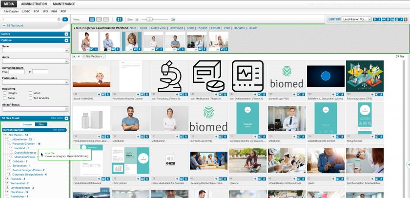
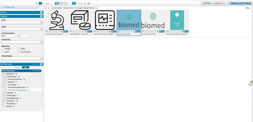
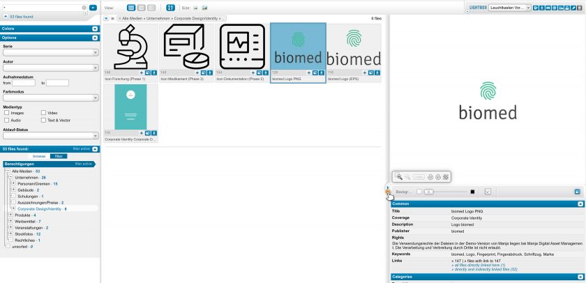
The display on the right side of the window shows the result list of the last search or the contents of the selected category. The following sections describe various actions, views, and possibilities for handling the result lists:
Actions
Back to top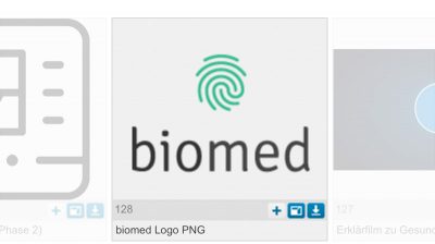
Below each preview image in the result list are three symbols. Clicking one of the symbols creates the following action for the individual file:
– add to lightbox – the file is added to the lightbox
– open – the file is opened in detail view
– download – a download dialog is opened for this file
Double clicking on the preview image opens the detail view as well.
Multiple Choice
Back to top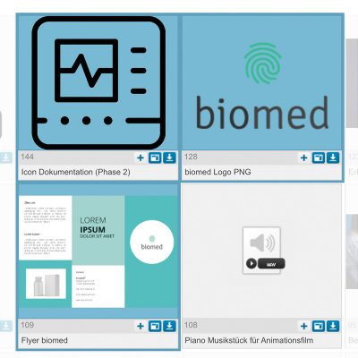
If you do not want to work with individual files only, there are three ways to select several search results and to apply the respective action to the files of the entire selection.
First: Left click on any place in the result list, keeping the mouse button pressed, and move the mouse pointer over the desired files. This will open up a frame and all files within the frame are selected.
Second: Click on a file. Once it is highlighted, use the shift key on the keyboard and then highlight the next file. All the results between the first and last file selected are now highlighted and can be further edited.
Third: To individually add or remove a file from the selection, click the file while holding down the Control key (Ctrl) on the keyboard.
This way you can highlight files individually or as desired, even if they are not shown immediately adjacent.
Toolbar
Back to top
Toolbar with the various functions
At the bottom of the window you will find a toolbar, which can initiate the following actions for the selected files:
- Open/edit – highlighted files are opened in detail view
- Lightbox – highlighted files are added to the lightbox
- Download – opens the dialog to download the highlighted files
- Send – opens the dialog to send the highlighted files
- Publish – opens the dialog to publish the highlighted files
- Export – opens the dialog to export the highlighted files
- Print – opens the dialog to print the highlighted files
- Delete – highlighted files are deleted (if authorized to do so)
If you are sufficiently authorized, the action “upload files” appears as well, opening the dialog to upload new files.
Mini Toolbar and Drag & Drop
Back to top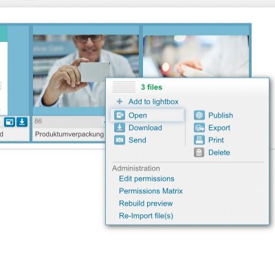
By single clicking a file or after selecting one or more files, a mini toolbar appears automatically, containing all the actions available:
• + Add to lightbox
• – Remove from lightbox
• Open
• Download
• Send
• Compare – if exactly one or two files are selected
• Publish
• Export
• Delete – if authorized
• Edit permissions – administrators only
• Provide new preview – administrators only
• Re-import file/s – administrators only
By clicking and pulling the drag point at the top left, you activate the drag & drop functionality. The drop targets available (lightbox and categories) are highlighted in red.
With the drag & drop functionality you can also resort files within the lightbox.
Context Menu
Back to top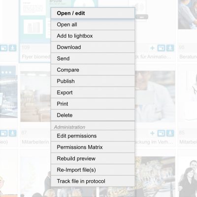
Next to the tool bar there is a quick access function to all actions.
Right click on highlighted results.
A context menu opens up, showing the available actions.
The actions refer to all selected files.
Views
Back to topYou can display the results in three different views. There are three options to do so in the display menu:
First: The tabular view – shows the preview image, file number and (depending on user configuration) single-line metadata per result.
This option is ideal for viewing many preview images at once.
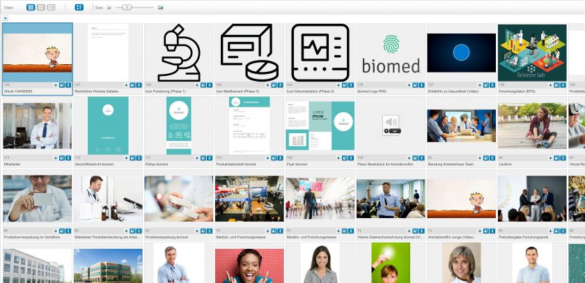
Second: The compact view shows only the preview images, without additional information.
This option is ideal for getting a quick overview of all files.
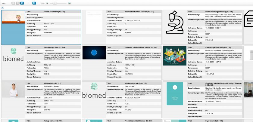
Third: The list view – results are shown one below the other, each with preview image and various user-configured metadata (such as title, description, utilization rights, formats, etc.)
This option is ideal for immediately accessing the associated file information besides the preview.
File Preview
Back to topThe file preview enables a quick preview of files, including their metadata.
In order to open it, you click on the marked space on the right edge of the screen.
You can adapt the width and height of the preview as required. Clicking again on the marked space closes the file preview.
You can also navigate within the results list by using the arrow keys on your keyboard.
Sorting
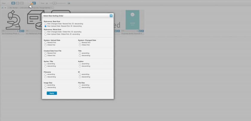
Back to topYou can sort your search results according to certain criteria. Click on the “sort” symbol in the menu. A selection menu opens up, where you can adjust your individual settings. The sorting sequence applies to the current and to all the following search queries.
Size of the Preview Images
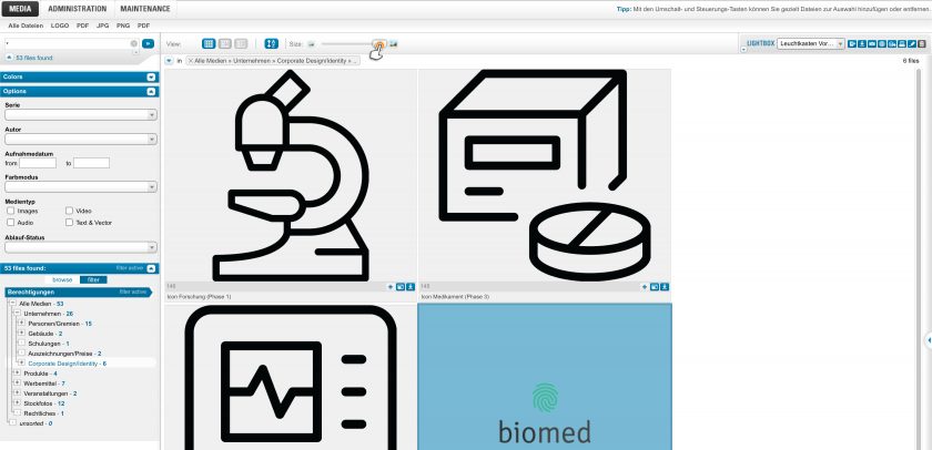
Back to topIn order to change the size of the preview images, pull the slider in the respective direction: to the left = smaller, to the right = larger. You can also click on the symbols to the left and right side of the slider. The result list is adjusted accordingly and the preview images are loaded in the selected size.
