Find & Organize Files
Actions and views for founded files
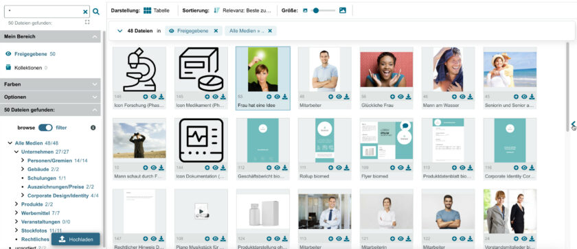
The display on the right side of the window shows the result list of the last search or the contents of the selected category. The following sections describe various actions, views, and possibilities for handling the result lists:
What options do I have when I have searched and filtered for files? The options in the results list are described and explained in this post.
Tip: On our page Features & Add-ons we have compiled an informative overview of all our features. Additionally, we offer a general description about multifunctional search and how files are organized and managed in Manja.
Actions
Back to top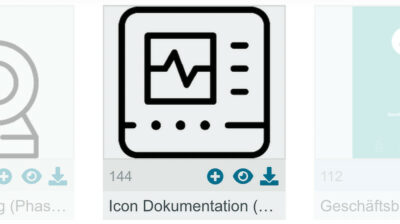
Below each preview image in the result list are three symbols. Clicking one of the symbols creates the following action for the individual file:
● Add to collection – the file is added to a collection
● Open – the file is opened in detail view
● Download – a download dialog is opened for this file
Double clicking on the preview image opens the detail view as well.
Icons & status flags
Back to topIn the results view, various icons can be displayed on the asset. These icons illustrate special statuses or provide references to stored information.
This includes, for example, comments that have been made on an asset (belongs to the Collaboration & Annotations add-on). Or expiration dates that have been set for the asset – such as the start date in the future or a past expiration date.
Or also, if e.g. the Release Projects add-on is installed, specific information about the status of the asset within a Release Project.
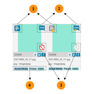
The following icons or flags can appear on an asset:
(1) Release projects (active and archived),
(2) File contains comments/annotations,
(3) Expiration dates (start in the future and expiration date expired).
(4) Own flags & status icons
More freedom for own flags & status icons (4)
- for own flags & status icons there are possibilities to realize them by configuration & CSS,
- especially styles (e.g. colors) can be selected based on the content of metadata fields.
Multiple file selection
Back to top
If you do not want to work with individual files only, there are three ways to select several search results and to apply the respective action to the files of the entire selection.
Variant with mouse:
Left click on any place in the result list, keeping the mouse button pressed, and move the mouse pointer over the desired files. This will open up a frame and all files within the frame are selected.
Variant with keyboard:
Click on a file. Once it is highlighted, use the shift key on the keyboard and then highlight the next file. All the results between the first and last file selected are now highlighted and can be further edited.
Variant with mouse and keyboard:
To individually add or remove a file from the selection, click the file while holding down the Control key (Ctrl) on the keyboard.
This way you can highlight files individually or as desired, even if they are not shown immediately adjacent.
Drag & Drop
Back to top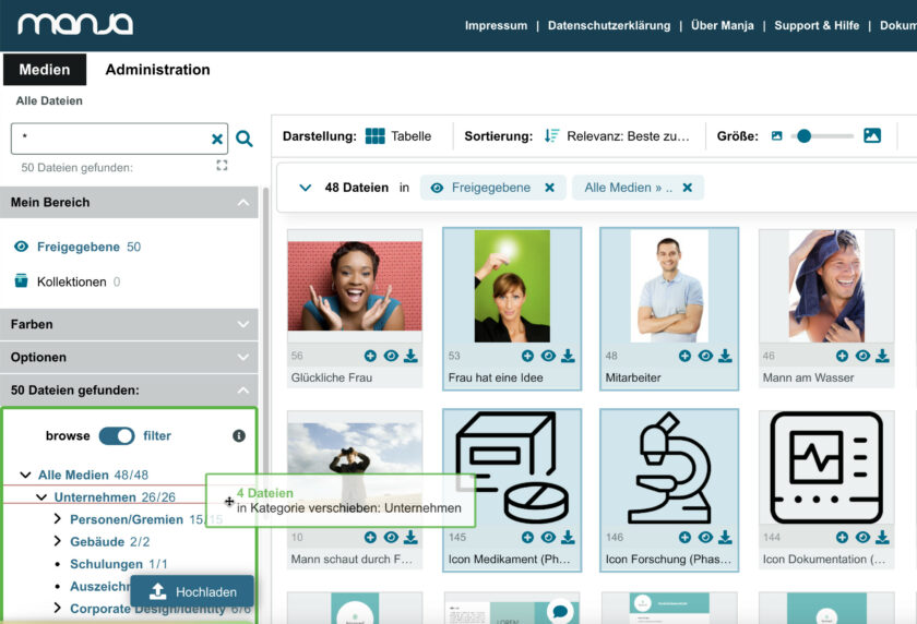
Drag & Drop
Utilize Context Menu
Back to top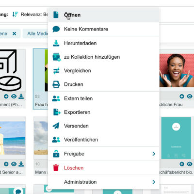
Next to the tool bar there is a quick access function to all actions.
Right click on highlighted results. A context menu opens up, showing the available actions. The actions refer to all selected files.
Switch Views
Back to topYou can display the results in three different views. There are three options to do so in the display menu:
The tabular view
It shows the preview image, file number and (depending on user configuration) single-line metadata per result.
This option is ideal for viewing many preview images at once.
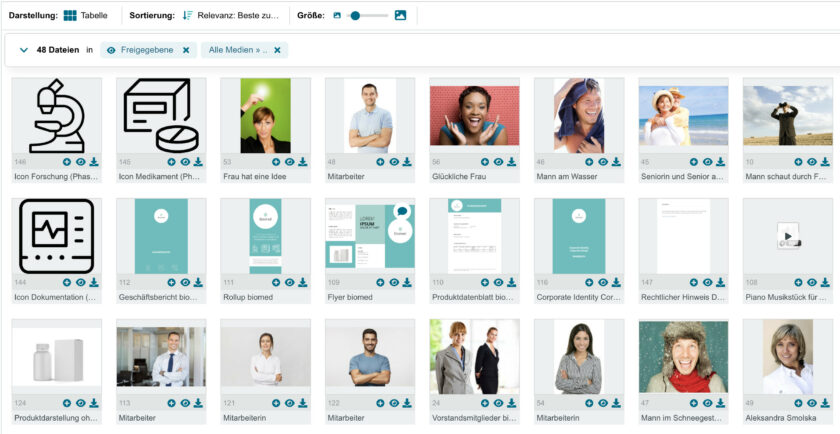
Darstellungsart: Tabellen-Ansicht
The Compact view
It shows only the preview images, without additional information.
This option is ideal for getting a quick overview of all files.

Darstellungsart: Kompaktansicht
The List view
The List View results are shown one below the other, each with preview image and various user-configured metadata (such as title, description, utilization rights, formats, etc.)
This option is ideal for immediately accessing the associated file information besides the preview.
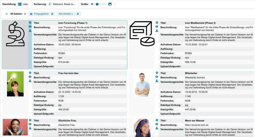
Darstellungsart: Listenansicht
Show File Preview
Back to topThe file preview enables a quick preview of files, including their metadata.
In order to open it, you click on the marked space on the right edge of the screen.
You can adapt the width and height of the preview as required. Clicking again on the marked space closes the file preview.
You can also navigate within the results list by using the arrow keys on your keyboard.
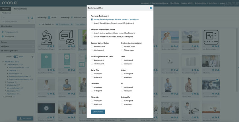
Change Sorting
Back to topYou can sort your search results according to certain criteria. Click on the “sort” symbol in the menu. A selection menu opens up, where you can adjust your individual settings. The sorting sequence applies to the current and to all the following search queries.
Size of the Preview Images
Back to topIn order to change the size of the preview images, pull the slider in the respective direction: to the left = smaller, to the right = larger. You can also click on the symbols to the left and right side of the slider. The result list is adjusted accordingly and the preview images are loaded in the selected size.

Größe der Vorschaubilder von Dateien per Slider festlegen
